We construct our websites so that users may change text, graphics and colours to suit their needs as their businesses evolve. Consequently, the thumbnails you see displayed below may not ‘match’ the websites perfectly anymore, due to changes the users have made. I show my original design in the thumbnails displayed below for your information
Here is a little website I created and polished up for someone who had started, but didn’t really know how to finish it off. I used a child theme to tweak it a bit so that certain features … like fonts, sizes of various page elements, footers and headers looked a little more like what the user required.
I guess when one client is satisfied word spreads arou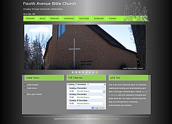 nd and you get another one. So, this is the second church website on my list. This was an interesting project because I was told specifically which colors to use (black and green) and there were some specific requirements for the site including a fly-out headline and a blog. All in all, a satisfying project. In addition, my first entire website move from development folder to live website went without a hitch. (Well, a few hitches, … but it’s not my fault that WordPress doesn’t scan for every reference to the new location of the media library and change it automatically like it should! Oh well!)
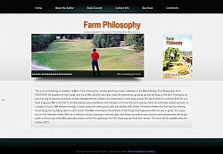 There is something satisfying about building a website which memorializes somthing or someone else. This website is in memory of a talented man who left this earth before his time, but nevertheless left something behind by which everyone can remember him by … a series of written articles. This website will help those who greive his loss by spreading the news about the book they are publishing. This book contains the articles their talented husband, father and grandfather wrote. His wife says:
“Thank you very much for all your work in getting this website going. We all appreciate it very much!”
Somet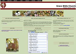 imes
imes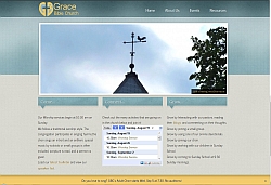 websites get that ‘old’ look.That’s what happened here. It was time for a total revamp of the website shown at the left. A new modern look with more space and less content crammed into a small space was called for. This church website incorporates an event calendar, a pastor’s blog, and important announcements to the congregation… all important features in any church’s website. A child theme and a little bit of extra coding created what you see on the right (Click on the picture to go to the actual website).
Another web store done! This project involved a Sunday School curriculum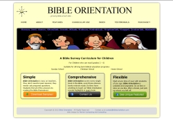 which posed some unique challenges…including my first implementation of a child theme. Child themes allow you to change the original theme of the website almost at will by adding your own styling to it. Styling includes things like the way the text is displayed, where images are put, and how things behave in general. This is the second time we used the Ekwid store plug-in and it does the job admirably. This was the first time we implemented a store in which the product was entirely electronic…and it seemed to go off without a hitch!
Web stores is where web development is at now, it seems, and this is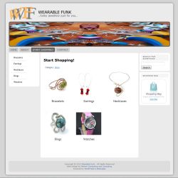 my first attempt at creating one. Wearable Funk comes with all the usual features… product categories, product descriptions, photos and options, shopping cart, checkout, tax calculations, shipping charge calculations etc. The hardest thing about doing this project wasn’t the actual setup of the store, it was trying to take photos of the products so that they appeared on a white background. That’s really quite tricky, especially if the product itself is light in colour. At any rate, take a look at the Wearable Funk website … who knows, you might want something similar! If you do, give me a call!
We construct our websites so that users may change text, graphics and colours to suit their needs as their businesses evolve. Consequently, the thumbnails you see displayed below may not ‘match’ the websites perfectly anymore, due to changes the users have made. I show my original design in the thumbnails displayed below for your information.
This ‘heritage’ project was a challenge, not only in that it was to become a  repository for thousands of pictures with titles, descriptions and keywords, but descriptions, titles and keywords were to be searchable. Once found, all search results would be displayed in a gallery on a new page. Many of the photos would be poorly documented. Hence, the idea was that poorly documented photos could have additional information submitted by viewers who were browsing the website. This might result in some new information coming to light. Comments, however would need to be moderated by site administrators. Fortunately, after much searching, I found a plug-in which did nearly all of those things. It is called WP Photo Album Plus and is truly a lifesaver!!
My first ‘larger’ project which encompassed 8 separate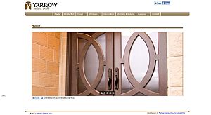 photo galleries with about 250 pictures. I used the ‘nggallery’ plug-in along a thumbnail template. I also used the ‘royal slider’ for the first page and the Weaver Pro template. The key here was to put it all together in a clean looking site. And ‘putting it all together’ was a great deal of fun! Thanks to Yarrow Sash and Door for the opportunity to become familiar with galleries, slideshows and image presentation software in Wordpress!
Photography is one of our loves and so Joan’s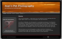 Pet Photography was an exciting website to create. Joan says:
“I had the pleasure of working with Ken last spring when he helped me set up a website. I found him to be helpful, considerate, and reliable. He did what he said he was going to do and went the extra bit when it was called for. I would happily engage his services again.”